Modals are a great way to grab attention and present information without leaving the current page. In this tutorial, we’ll learn how to create a stylish modal popup that fades in and slides down from the top using HTML, CSS, and JavaScript.
Step 1: HTML Structure
Start by creating the basic structure of the modal:
- The 'button' element triggers the modal.
- The 'div' with the'modal' class serves as the overlay.
- The 'div' with the 'modal-content' class contains the modal’s content.
Step 2: CSS Styling
Use CSS for styling and animation:
body {
    font-family: Arial, sans-serif;
}

button {
    margin: 20px;
    padding: 10px 20px;
    font-size: 16px;
    cursor: pointer;
}

.modal {
    display: none;
    position: fixed;
    top: 0;
    left: 0;
    width: 100%;
    height: 100%;
    background: rgba(0, 0, 0, 0.5);
    justify-content: center;
    align-items: flex-start;
    animation: fadeIn 0.3s ease-out;
}

.modal-content {
    margin: 100px auto;
    background: #fff;
    padding: 20px;
    border-radius: 8px;
    box-shadow: 0 5px 15px rgba(0, 0, 0, 0.3);
    width: 80%;
    max-width: 500px;
    animation: slideDown 0.5s ease-out;
}

.close {
    position: absolute;
    top: 10px;
    right: 20px;
    font-size: 24px;
    cursor: pointer;
}

@keyframes fadeIn {
    from {
        background: rgba(0, 0, 0, 0);
    }
    to {
        background: rgba(0, 0, 0, 0.5);
    }
}

@keyframes slideDown {
    from {
        transform: translateY(-50px);
        opacity: 0;
    }
    to {
        transform: translateY(0);
        opacity: 1;
    }
}
Step 3: JavaScript for Interaction
Now, add JavaScript to handle the modal’s behavior:
document.getElementById('openModal').addEventListener('click', function () {
    const modal = document.getElementById('modal');
    modal.style.display = 'flex';
});

document.getElementById('closeModal').addEventListener('click', function () {
    const modal = document.getElementById('modal');
    modal.style.display = 'none';
});

window.addEventListener('click', function (e) {
    const modal = document.getElementById('modal');
    if (e.target === modal) {
        modal.style.display = 'none';
    }
});
This script ensures that:
- Clicking the "Open Modal" button shows the modal.
- Clicking the close button or outside the modal content hides it.
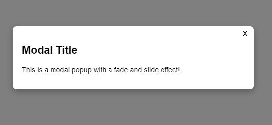
Live Demo
Combine the HTML, CSS, and JavaScript, and you'll have a working modal popup with a beautiful fade and slide effect.
Final Thoughts
Modals are versatile and enhance user engagement. This tutorial showcases a simple yet effective way to implement a fade and slide effect for your modal popup. Customize the styles and animations to suit your design preferences.
No comments:
Post a Comment